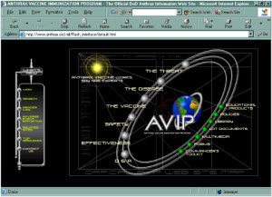
 Here are a few annotated website screen shots that we’ve created over the years to help Web publishers appreciate the benefits of living by the rules of smart usability—and the pain of ignoring them.
Each is a stand-alone PDF document that you can print, save, or share. To download, click on the titles.
Fuzzy Identity: No matter how visitors arrive at your Web site, they need to know instantly what it’s all about and what it enables them to do. (12/20/06)
Vertical Space Hogs: Beware oversized logos, image-heavy banners, and other non-informational elements that squander a Web page’s most precious resource. (1/3/05)
Clear Link Descriptions: Clear labels tell users the payoff. That gets them to click. Here’s a great example. (2003)
Lost Below the Fold: It’s amazing how many Web sites bury important stuff below the first visible screenful. (2003)


