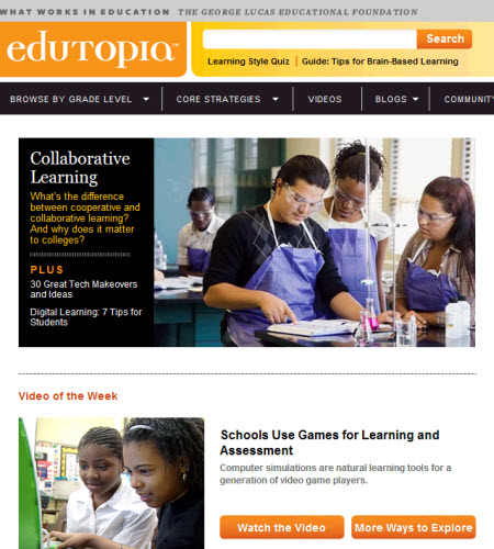
Edutopia.org, the website of the George Lucas Educational Foundation, was hampered by uninformative labeling and a sometimes puzzling organization that hid valuable content.
We helped site managers define their primary audiences and create a more effective architecture and presentation style to engage with those users. Our redesign recommendations advised on “editorial packaging”—clear, informative labels and compelling writing—to help site visitors immediately connect to the content most relevant to them.
RESULTS
- The site’s redesign introduced a much clearer organization tailored to its primary users.
- Immediately after relaunch, traffic increased significantly.
“Michael and Susan played a key role in helping us plot a redesign strategy for our website. We—and our users—have been very pleased with the results.”
former Web Content Manager, GLEF